Footer Content
The content and links in the footer help users find additional information, facilitate navigation, build trust in the website, and discover service and support offerings. This increases user-friendliness and the sense of completeness of the website.
A special feature of the Footer content type is its division into two areas: “Footer” and “Socket.” The socket acts as a mini-footer and is used with all legally relevant links (e.g., privacy policy, imprint) especially in the checkout tunnel.
Structure and Maintenance of the Footer
The footer is divided into three sections: Footer Top, Footer, and Socket.
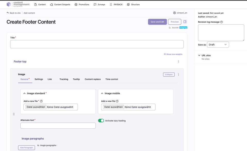
Footer Top
- An image above the footer, visible on all pages in the shop, which can be provided with tracking parameters.
- The image can be maintained for standard, tablet, and mobile.
- Mandatory fields: alternative text and title text.
- Links can include a target URL, target window (_self,_blank, _top), and tracking parameters.
- Additional features such as bonus number, anchor link, highlight entry, search filter, and onload tracking are available.
- Image variants, alignment, display form (standard, circle), lazy loading, and time control (valid from/to) can be configured.
Footer
- The footer is structured in column blocks: badges, image, list, text.
- Each block can be individually filled with additional elements.
- Blocks are arranged in four rows; from the fifth block on, a new row begins.
- Examples of blocks:
- Text block: headline and text content (e.g., contact address)
- List block: simple list, displayed as a UL list with checkmarks
- Image block: small icons or text (e.g., payment methods)
- Badge block: external scripts, images, or SVG graphics (e.g., app store icons)
Socket
- The socket is the narrow strip at the bottom of the page.
- The paragraphs “HTML” and “Text-Link-Modal” are available for the socket.
- The text size is adapted for the socket display.
- Typical content: legally relevant links such as imprint, privacy policy, cookie notice, and service/shipping costs (modal box).
Fields and Options
| Field | Description |
|---|---|
Footer Top | Image and links above the footer, including tracking and time control. |
Footer | Column blocks with freely selectable content (text, list, image, badge). |
Socket | Mini-footer at the bottom of the page for legal links and notices. |
ADD Paragraph | Add sections/building blocks; available paragraphs are identical on all pages. Details are described in a separate chapter. |
Save as | Set the status when saving: Draft, Published, or Unpublished. |
Publication Workflow
- When saving, select the desired status via “Save as” (Draft, Published, Unpublished).
- After the first save, the page appears in the content overview and can be further edited.
Not covered on this page
- Image sizes and formats: documented separately.
- Detailed description of paragraph blocks: see separate chapter.