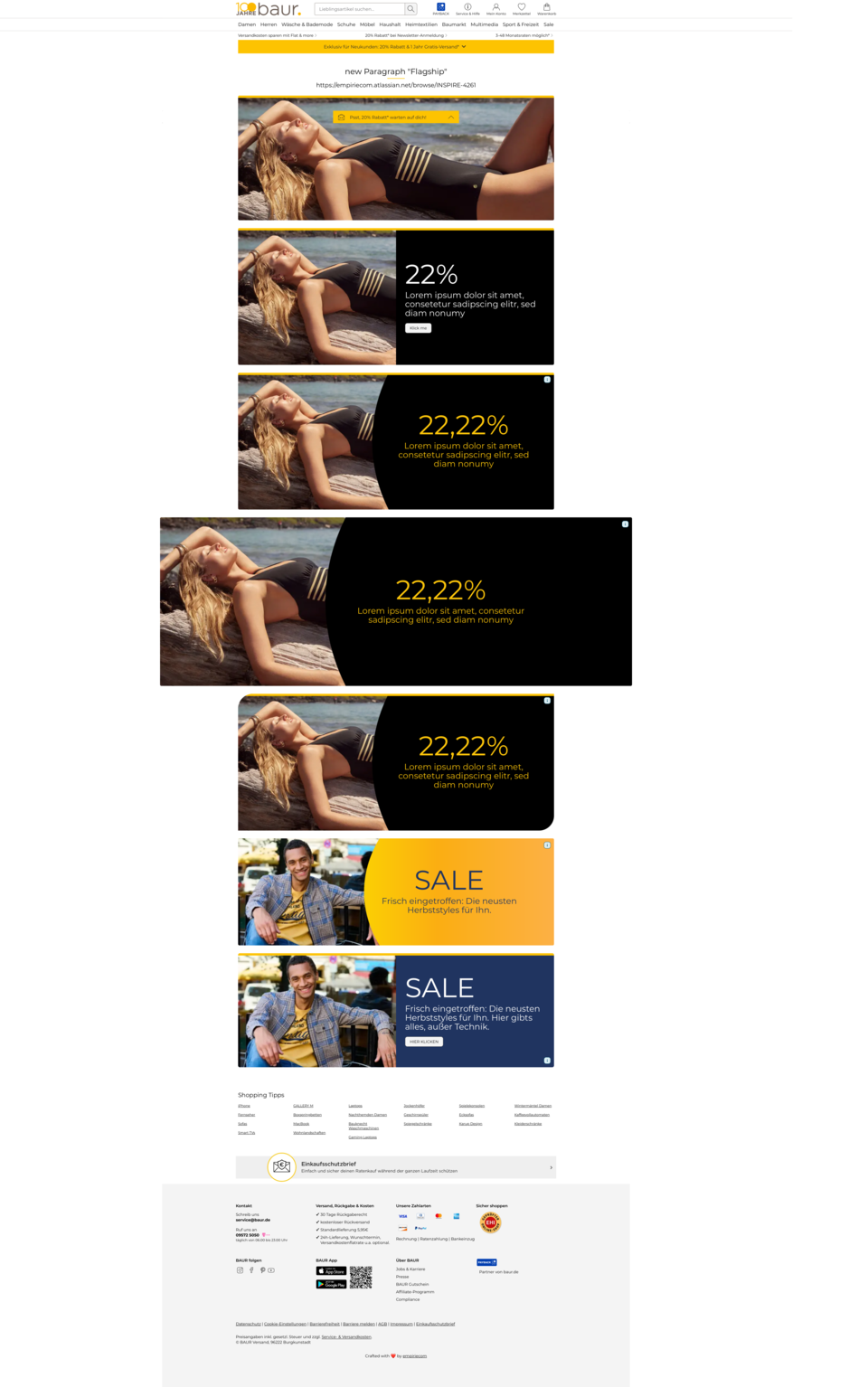
Paragraph Flagship-Teaser
The Flagship-Teaser is designed to prominently showcase key topics or campaigns in the storefront. With large images and striking typography, it immediately draws attention and places important content at the top of the page. Users instantly recognize which topic is currently in focus, providing orientation and guiding the user journey. At the same time, the paragraph supports emotional appeal and strengthens brand impact. For editors, it offers the opportunity to clearly prioritize and highlight relevant content without needing technical layout adjustments.
Features & Layout Options
The “Flagship-Teaser” paragraph offers three layout variants:
- Split Layout: Image and text side by side.
- Split Layout with Curve: Like Split Layout, plus a decorative, curved area (“Curve”) between image and text.
- Image Only: Only an image, no text.
Layout selection is made via a dropdown option in the backend. Depending on the selection, different rendering logics are applied.
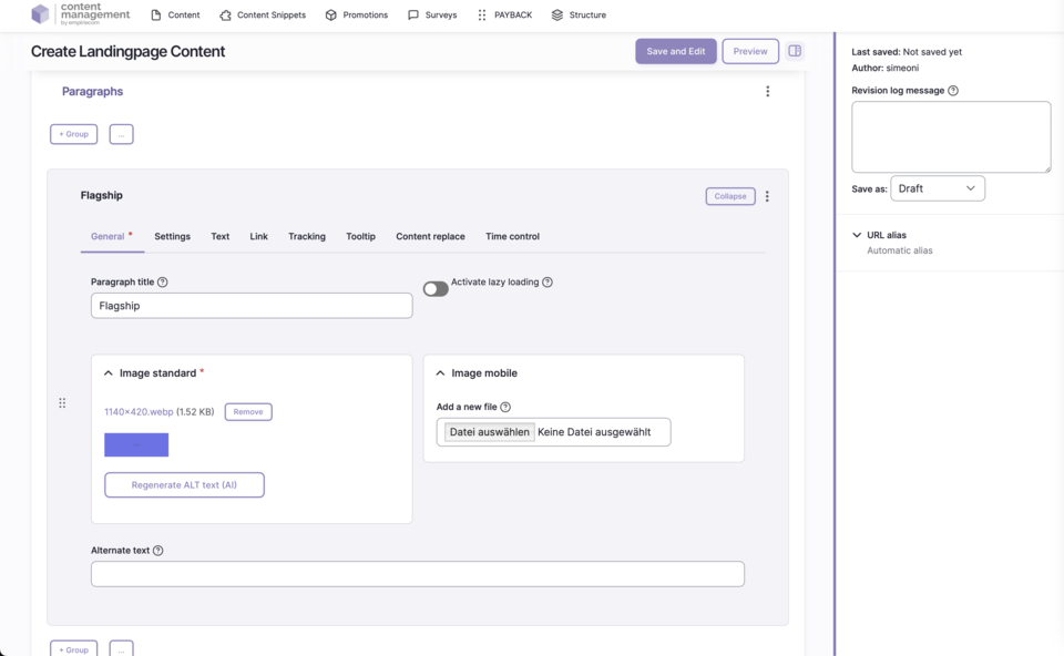
Backend Configuration
Steps
- Create ContentType.
- Insert “Flagship” paragraph.
- Configure and add Flagship-Teaser.
Image Handling
Text Handling
Styling Options
Configuration Options
| Field | Description |
|---|---|
Image - Standard | Use the “Select file” button to upload an image directly from the editor’s hard drive to the CMS. |
Image - Tablet | Optionally, an image can be uploaded specifically for tablets – if not, the standard image is shown. |
Image - Mobile | Optionally, an image can be uploaded specifically for mobile – if not, the standard image is shown. |
Alternate Text | Text description for the image. Required for SEO and accessibility. |
Title | Additional information for the image – appears as a tooltip layer on mouseover with explanatory text. |