Paragraph Linkbox
The Linkbox is used to prominently display one or more links within the layout. It consists of individual elements that can optionally be arranged around a graphic. In its simplest form, the Linkbox enables the publication of a linked image via the CMS. Optionally, the Linkbox can be extended with additional content such as headline, subline, copy text, and a CTA to enrich links with content and highlight them purposefully.[1]
Features & Benefits
- Prominent display of links and actions in the page layout
- Combination of image, text, and link possible
- Flexible alignment and arrangement of content (top, bottom, left, right)
- Various display variants: Standard or Boxed
- Extendable with headline, subline, copy text, and call-to-action (CTA)
- Custom margins for precise placement
- Optional: graphic as a central element
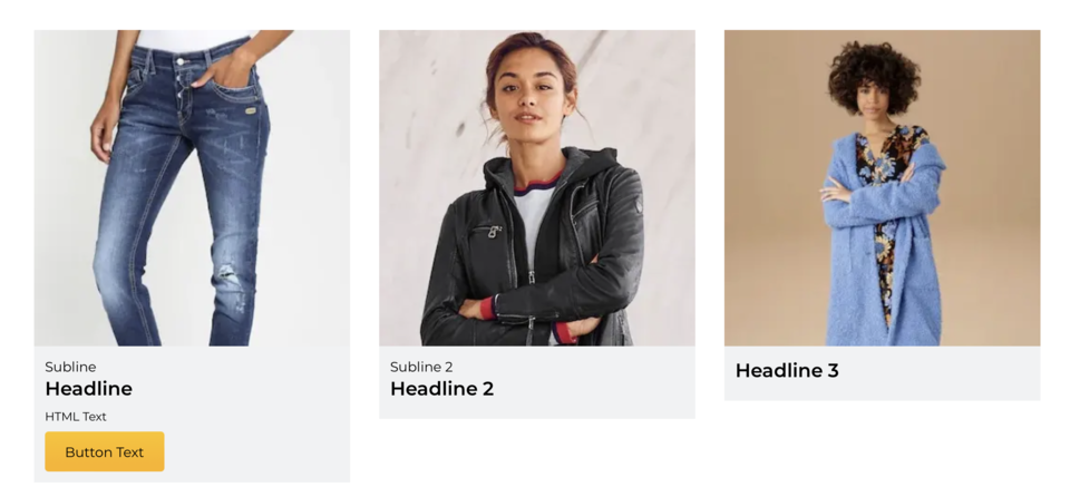
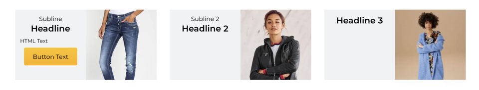
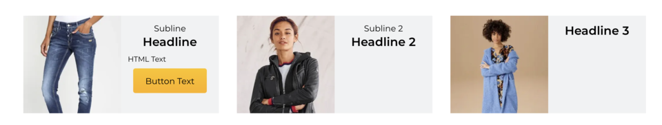
Example Image
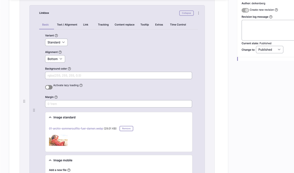
Backend Configuration
Steps
- Create ContentType.
- Insert the “Linkbox” paragraph.
- Configure the Linkbox with the desired settings and content.
Settings & Fields
| Field | Description |
|---|---|
Variant | Standard | Boxed |
Alignment | Bottom | Top | Left | Right |
Margin | Shorthand for four values: top, right, bottom, left (e.g. 25px 50px 75px 100px) |
Image Standard | Image upload for the Linkbox |
ALT Text | Alternative text for the image (important for SEO and accessibility) |
TITLE | Additional image title (appears as a tooltip layer on mouseover) |
SUBLINE | Optional: Subline below the headline |
HEADLINE | Optional: Headline in the Linkbox |
HTML Text | Optional: Copy text/free text in the Linkbox |
CTA Text | Optional: Text for the call-to-action button |
CTA TYPE | Optional: Type of CTA button |
Display Variants
 Boxed, text below, margin “0 1rem”
 Boxed, text left, margin “0 1rem”
 Boxed, text right, margin “0 1rem”
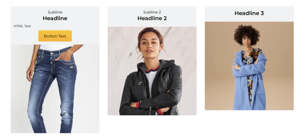 Boxed, text above, margin “0 1rem”
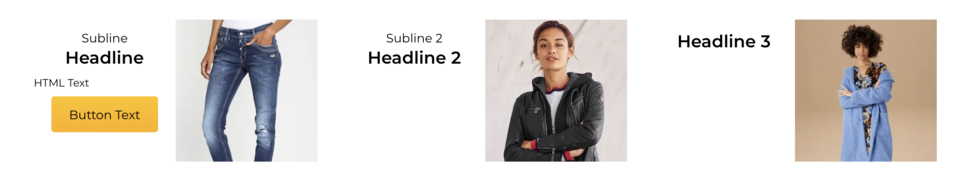 Standard, text left, margin “0 1rem”
Additional Configuration Options
| Field | Description |
|---|---|
Spacing Type | none | page width | page width with some left/right spacing on mobile | window width |
Alignment | None/Standard | Left | Center | Right |
Vertical Alignment | None | Top (flex-start) | Bottom (flex-end) | Stretched (stretch) | Top | Center | Bottom |
Link | Target (_self, _blank), bonus number, anchor, highlight, search filter |
Tracking | Campaign ID, type, category, detail, name |
Tooltip | Activate/deactivate tooltip, position, promotion text or content snippet |
Personalization | Display for specific user groups (anonymous, logged-in customers, bonus program, credit affinity) |
Accessibility | Activate skip link, freely nameable |
Replace Content | Content can be dynamically replaced using Dynamic Yield ID |
Time Control | Control visibility of the Linkbox by time (from/until) |