Column Layout
The column layout enables flexible arrangement of content in the CMS. Depending on requirements, different column configurations can be selected and set separately for desktop and mobile.
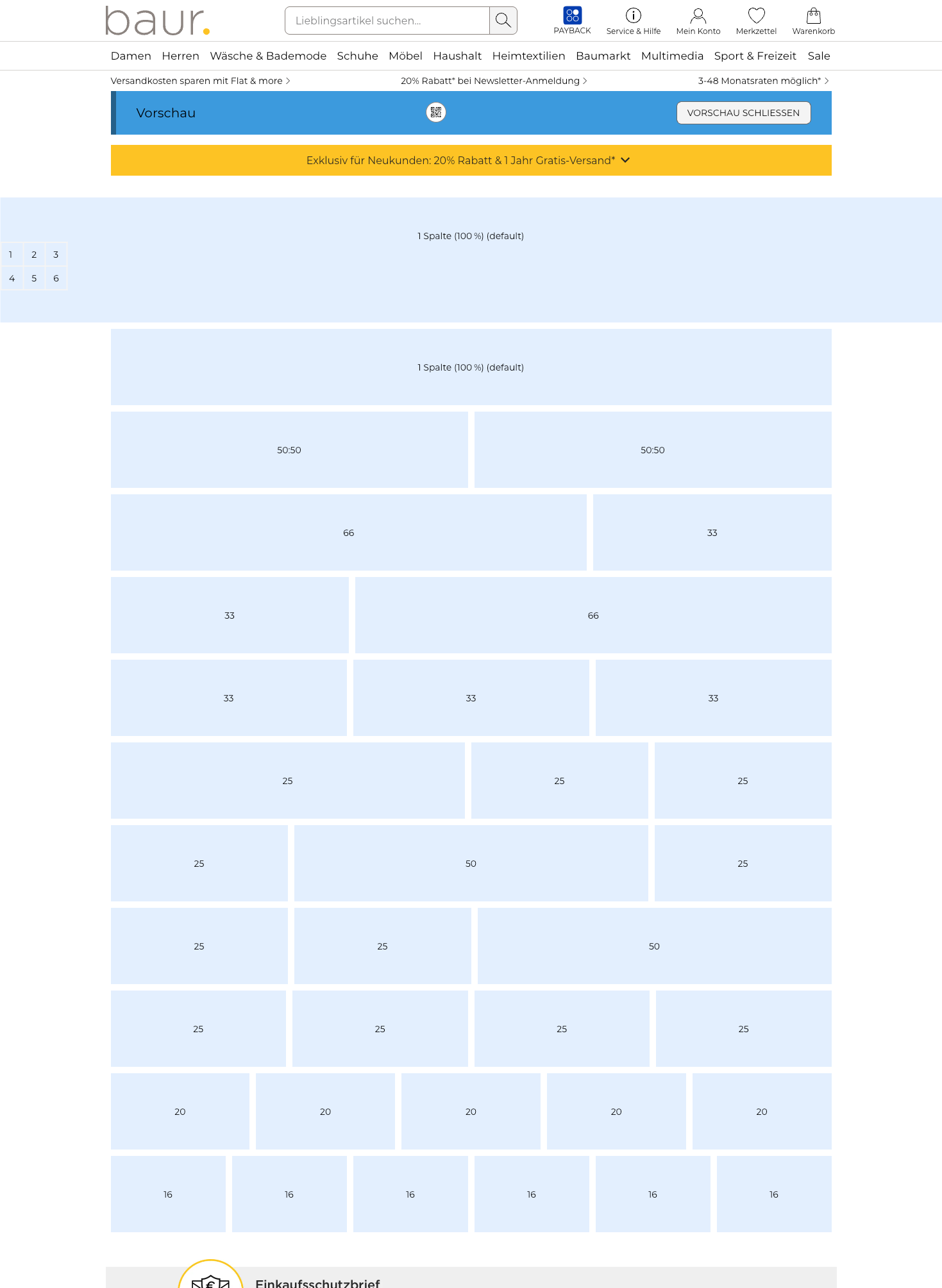
Available Column Layouts
| Column Layout | Description |
|---|---|
1 column | 100% (Standard/Default): Use this layout for full-width content. |
2 columns 50:50 | Two columns of equal width. |
2 columns 66:33 | Left column takes up two thirds. |
2 columns 33:66 | Right column takes up two thirds. |
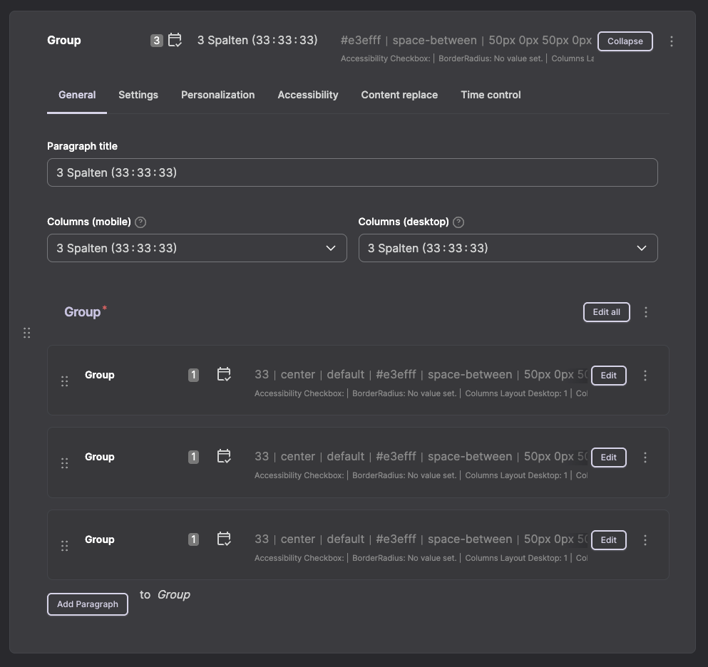
3 columns 33:33:33 | Three columns of equal width. |
3 columns 50:25:25 | First column takes up half. |
3 columns 25:50:25 | Middle column takes up half. |
3 columns 25:25:50 | Last column takes up half. |
4 columns | 25:25:25:25 – Four columns of equal width. |
5 columns | 20:20:20:20:20 – Five columns of equal width. |
6 columns | 16.6:16.6:16.6:16.6:16.6:16.6 – Six columns of equal width (each 16.6%). |
Separate Settings for Desktop and Mobile
The column distribution can be configured separately for desktop and mobile views. This allows for optimal display on all devices.
Example:
- Desktop: 3 columns (33:33:33) for a clear product overview
- Mobile: 1 column (100%) for better readability on small screens
Best Practices
Responsive Design
- For mobile devices, generally choose fewer columns than for desktop.
- For more than 3 columns on desktop, it is recommended to reduce to 1–2 columns for mobile.
- Test the display on different screen sizes.
Nesting
- Columns can be further subdivided by nesting groups.
- Make sure to keep the structure clear.
- Too deep nesting can negatively affect performance.
Operation in the CMS
| Step | Description |
|---|---|
Number of columns desktop | Select the desired number of columns for the desktop view. |
Number of columns mobile | Select the desired number of columns for the mobile view. |
Areas for content | Depending on the number of columns selected, the corresponding areas for content will appear. |
Insert paragraphs | Add the desired paragraphs to each column area. |
Use preview function | Check the display on desktop and mobile using the preview before publishing the page. |