Tooltip Function in Drupal CMS
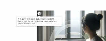
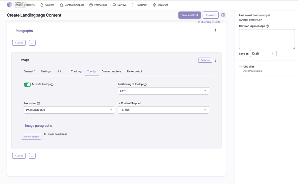
The tooltip component allows you to embed small info icons at various places on a Drupal page. On mouseover or touch, a short, context-related text is displayed in an overlay. Tooltips provide additional information without disrupting the page flow or visual hierarchy. The content is centrally maintained in the CMS and can originate either from promotion descriptions or the “Tooltip” content snippet.
Use Cases
- Within headline text: Headlines can be supplemented by an info icon at the end. The icon color adapts to the headline.
- On images: The info icon can be positioned in any corner of an image. The corner is selected via dropdown, with four options and two color variants available.
Features & Configuration
| Field | Description |
|---|---|
Activation | Tooltips can be globally enabled or disabled. |
Positioning | Flexible placement of the info icon: next to text (right/left) or in any of the four corners of an image. |
Color | Choose between two color variants, depending on the context (e.g., headline, image). |
Content | The text source is either the description of a promotion code or the “Tooltip” content snippet. |
Priority Rule | If both are configured, the promotion text is always displayed. |
Usage Areas | The info icon can be used in promotion banners, headlines, images, and USP bars. |